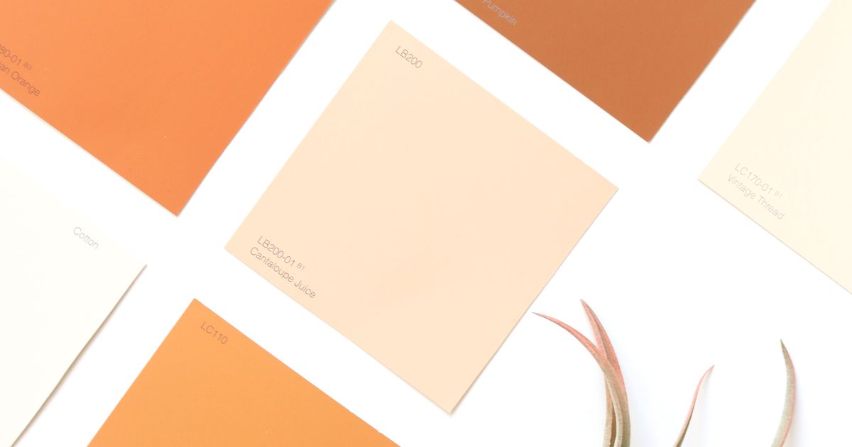
How to Pick a Presentation Color Palette
A practical, repeatable method for choosing slide colors — primary, neutral, and accent — that look professional every time.
A palette you can reuse
Most decks only need three roles: a primary brand color, a neutral for
text and backgrounds, and one accent for emphasis.
A simple method
- Primary — pick one color that matches your brand or topic.
- Neutral — a dark slate for text and a near-white for backgrounds.
- Accent — one contrasting color for highlights and data.
Rules of thumb
- Keep text on background at a 4.5:1 contrast ratio for readability.
- Limit yourself to one accent; more colors read as noise.
- Test the deck on a projector — colors shift under bright light.
Primary   #4f46e5  (indigo)
Text      #0f172a  (slate-900)
Surface   #f8fafc  (slate-50)
Accent    #d946ef  (fuchsia)
A disciplined palette does more for professionalism than any single template.
Ready to create your own presentation?
SlidePilot turns your topic into a polished PPTX deck with AI-generated visuals — no design skills needed. Start free with 50 credits.
Keep reading
 Guides
Real Photos, No Watermarks: Web Image Search for Your Deck
When an AI illustration is not the right fit, SlidePilot searches the web for a real photo that matches the slide — filtering for relevance, blocking duplicates, and removing watermarks before a single image reaches your deck.
 Guides
Math Formulas as Transparent PNGs: Equations That Render Everywhere
Paste a document with LaTeX equations and every formula is rendered offline into a crisp transparent PNG — sized and colored to match the surrounding text, and identical in PowerPoint, Keynote, Google Slides, and WPS.
 Guides
What's New: Image-Led Decks and Faster Exports
A short product update — improved PNG to PPT handling, cleaner exports, and a friendlier editor for publishing posts like this one.